Wurmpedia editing handbook
Contents
- 1 Guidelines
- 2 General Wurmpedia Etiquette
- 3 Stylistic Guide
- 4 Namespaces
- 5 Settings
- 6 Special Pages
- 7 Editing Basics
- 8 Creating New Articles
- 9 Templates
- 10 Tables
Guidelines
The Wurmpedia is a resource used by new and experienced players alike. It is typically the first place a new player will turn when they want to understand something. As such, we want the Wurmpedia to be as organized, accurate, and user-friendly as possible. These are some guidelines in place to help us all keep the Wurmpedia to a high standard.
General Wurmpedia Etiquette
As the Wurmpedia team works as a team, we want to run any large changes past other editors and WAs before taking any steps. Trying to look at similar pages before you correct any formatting.
If you see wrong information, you can correct it yourself, but you may want to bring it up on Discord if it seems like a larger issue. Please don't assume that incorrect wiki information is brought on by malice.
Please don’t edit anyone’s personal page, except your own. Exception: you may remove dead (red) links.
Let's be respectful of other WAs and editors and all staff. We all contribute!
As of right now, the only language we are translating the Wurmpedia into is Russian. If you’d like to work on another language project (or that one!) please message the Manager or the team in general.
Stylistic Guide
- Please use correct spelling and do not use slang, 'txtspk' or 'leet speak'. Example: 'You need to', not 'U need 2'.
- Spelling in Wurm is a strange and diverse mix of UK and US spelling. However, the Wurmpedia must conform to the game, not what we feel is the “right way”. So armour, but favor.
- If you aren't a spelling and grammar pro, use a spell checker. (IE FF Opera).
- Excluding proper nouns, words in page titles should not be capitalized. Use "Small metal shield" or "small metal shield"[1], and not "Small Metal Shield". Also, don't capitalize nouns in the middle of sentences, unless they're proper nouns.
- Don't use underscores in links - you don't need them! Example: [[item creation]] is equivalent to [[item_creation]], and looks twice as neat.
- Use wikitext instead of HTML when possible. Example: * lists instead of <br> lists
- Use the categories and templates when appropriate. Look at a similar page and see what it uses for hints.
- Use [[links]] when referring to other pages (refrain from linking the same page multiple times in the same article.)
- Much of our crafting information has been moved into the Itembox template, including dye information. Please don't add crafting instructions to the main wiki article, unless you check in with other WAs/staff. If you need help with the itembox, ask in Discord.
- Avoid personal bias when editing. When in doubt, take it to the talk page.
- Do not post suggestions. They belong in the forums or on IRC - not here.
Breadcrumbs
Please try to keep the breadcrumbs at the top of each page. In the Complete Database it is done like this:
[[CDB|Main]] / [[Example Page 1]] / '''{{PAGENAME}}'''
and in the rest of the wiki like this:
[[Main Page]] :: [[Example Page 3]] :: '''{{PAGENAME}}'''
Weights and measures
When indicating crafting materials, please be as explicit as possible.
For items with only one possible size (same weight, no combine), note the number of items needed with the suffix 'x', e.g. "15x stone brick". If the item can be reduced in weight (e.g. shaft), also include the minimum weight possible for use. For other items specify the total weight needed and avoid listing the "normal" number of items used.
For the English portion of the wiki, please use a decimal point (period) when referring to fractional numbers. Always specify weights with two decimal places. This avoids ambiguity between "item has integer weight" and "didn't bother to check exact weight".
Itembox
We have moved much of the information on crafting into the itembox, including dye information. Please don’t add crafting instructions to the main article.
Namespaces
What is a namespace?
A namespace is a section of the wiki dedicated to different sorts of topics or functionalities. They help organize the wiki and keep things easy to follow and understand. All namespaces begin with the namespace’s name followed by a colon, except for the main namespace. For example, Template:ItemBox is in the Template namespace.
What namespaces are there?
| Namespace | Usage | Permissions |
|---|---|---|
| Category | Used in creating lists of similar items. To add an article to a category, add to the bottom of the article, and the category will list it! | Editor+ |
| File | Where images are stored | Assistant+ |
| Guides | For writing guides on anything Wurm Online related - contains as much bias as wanted! All Guides namespace pages must have a {{guide}} template tag at the top (adds a disclaimer saying it is a player guide that is not staff maintained etc) | All |
| Help | Not really used, but contains (little) info on how to edit | Editor+ |
| Historical | Wurm Online actual PAST mechanics | Editor+ |
| Lore | Used to write stories that players want others to know about | All |
| Main | Wurm Online actual mechanics | Editor+ |
| MediaWiki | Contains wiki interface options; Manager only | Admin+ |
| Player | Players can write about their character here (or link to user page - typically, they tend to link their user page to their player page) - Note: Current owner of the account owns the player page, so if an account is sold, the account owner takes over | All |
| Settlement | Users can write about their settlements here. Must have permission from the Mayor to write (not monitored unless a complaint arises) | All |
| Talk | Discuss information found on the article | All |
| Template | Templates - Used when having the same information on multiple pages. Gives articles a specific look or text. | Editor+ |
| User | Wurmpedia account page - Users can write about themselves here | All |
| Wurmpedia | Information about the wiki, including wiki roles | Admin+ |
Main namespace
The main namespace contains articles regarding current mechanics. Pages in the main namespace do not have any label in front of the article name. EG: “Onion” is in the main namespace, “Historical:Onion” would be in the Historical namespace. More information on namespaces is in the next section.
Here are guidelines for the main namespace: Current information only (past functionality belongs in the Historical namespace) Avoid the use of the words: current, now, used to, will, etc. Avoid dates for when a feature was implemented. Users can check the edit log or the patch notesif they want to know when a feature was added. Known true information only (unknown information can be written on the article’s Talk page) Avoid the use of the words: probably, should, might, seems to, etc. Information may only be tested on Wurm Online, not Wurm Unlimited. You may use Wurm Unlimited to get an idea of what to do to test facts in Wurm Online as long as the information has been confirmed on Wurm Online. Keep information as clear and simple as possible. A table of what every skill level and tool quality affects is not necessary. The wiki does not contain any recipes. Recipes are meant to be discoverable by players, and players have other means to acquire help with their cooking questions.
Settings
As a new editor, you are probably just excited to dive in and get some sweet edits in. That's great! But it's also great to know that there are some settings in your Preferences that can make editing easier and more efficient.
Here are some basic outlines and comments about the most notable features you will find:
User Profile, Appearance, Editing
- User Profile: contains basic stuff like email and password, and ability to change them.
- Appearance: Here you can change the wiki skin (I hate all the other ones!), change the way dates and times are displayed, as well as your time zone, among some other things.
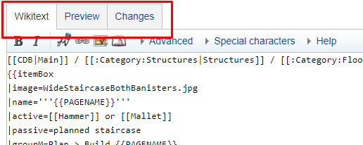
- Editing: The editing preferences contain many highly useful and awesome features that you can enable to help with your editing. You can Enable section editing by right clicking on section title, Edit pages on double click, Mark all edits minor by default, warn me when I leave an edit page with unsaved changes, side-by-side preview (shown below), and more.
Recent Changes, Watchlist, Search
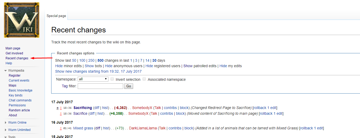
- Recent changes: You can view the recent changes, which shows articles and files recently edited, in the Recent changes page (linked on the sidebar, as shown below). In your preferences, you can change how this page will display by default, including how many days to show, number of edits to show, you can group changes by page, hide minor edits, hide patrolled edits, and more.
- Watchlist: When editing an article, you get the option (which is selected by default) to watch that page. You have a separate section to view your watched articles, which shows if edits have been made since you began watching that page.
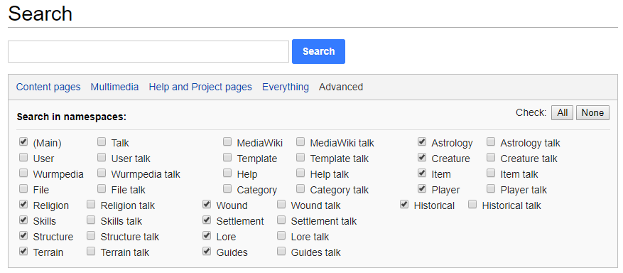
- Search: Which namespaces to search when you search for an article by default. When searching, you can also hit the magnifying glass, then go to Advanced, which will show the page pictured below. Here, you can select which namespace(s) you wish to search in. Great if you're looking for a particular kind of page!
Special Pages
There are some special pages on the Wurmpedia which collect articles based on some criteria. These special pages can be useful for finding articles that are out of date, have incorrect links, are missing images, and more. These pages are found here.
It is a good idea to check through some of these pages, especially if you are looking for something to edit but are having trouble figuring out what to do. There is always something that needs to be done on the wiki, even if all of those pages are up-to-date. If you are ever looking for work, please reach out to a Wurmpedia Assistant, Wurmpedia Assistant Manager, or Wurmpedia Manager.
Editing Basics
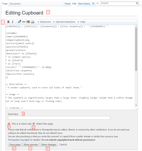
To edit an article, click on Edit at the top of the page. You will be brought to a page that looks like the one below. This is the editing page.
- Title – shows that you are editing a page, and the title of the page you’re editing.
- This is the page content. Written in Wiki Markup; there are a few tools at the top of the editor that will assist with basic things (bold, italic, linking to articles/websites).
- Summary – Brief description of what edits you’ve made. This helps future editors/readers see when a change happened should they require that information. The summary is quick and simple – for example, “grammar fix”, “typos”, “cupboard now requires 2 tar as of Jun 2nd update” or “June 2 update – 2 tar to make”. Anything that gets the point across!
- “This is a minor edit” – This is another tool to help editors/readers find particular changes. I mark almost everything as minor unless it is an overhaul of the page, if the page is being changed to a template, or something along those lines. Fixing typos are minor.
- “Watch this page” – I never really watch pages; this will show up in your watched items for X days (depending on your Preferences) for you to see if any other edits occur during that time.
- Save page – 99% of the time, I use #7 Show Preview first, to make sure I didn’t make any obvious errors. It is a lot easier to spot errors when you see it on the page rather than in the editor. Save page will save your edits to the page, along with your summary comment, and become live.
- Show preview – This shows what the page will look like should you save.
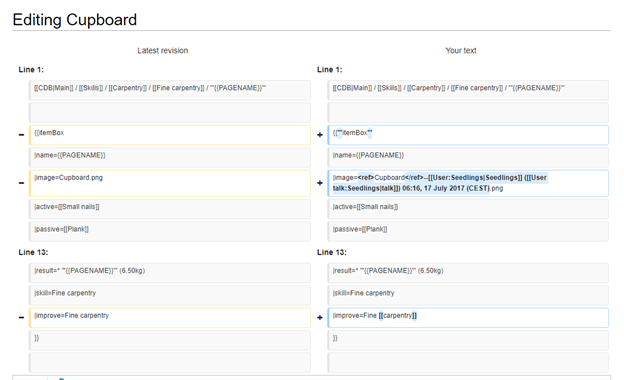
- Show changes – This will show you what changes you have made in this edit.
The right column includes your edits. Text is highlighted where you have made changes.
Basic Wiki Markup
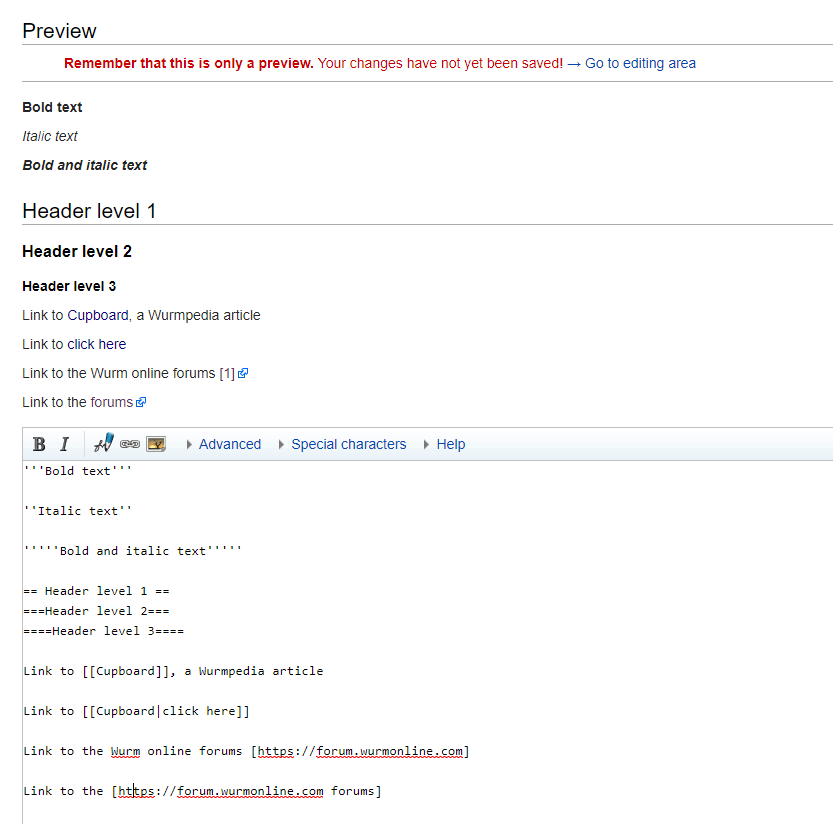
The Wurmpedia uses wiki markup, a type of coding language used to format text and images in a custom way. You can do anything from making text bold and italic, to making text appear only if certain conditions are met (for example, if the item is made of wood, display text indicating the types of wood that item can be made from). For this introductory course, you will be introduced to formatting text in bold and italics, creating headers, and linking to other articles or webpages. These are the most common markup codes you will use in editing.
| What to do | How to do it | What it looks like |
|---|---|---|
| Bold text | '''Bold text''' | Bold text |
| Italic text | ''Italic text'' | Italic text |
| Bold and italic text | '''''Bold and italic text''''' | Bold and italic text |
| Header level 1 | ==Header level 1== | |
| Header level 2 | ===Header level 2=== | |
| Header level 3 | ====Header level 3==== | |
| Link to Cupboard, a Wurmpedia article | Link to [[Cupboard]], a Wurmpedia article | Link to Cupboard, a Wurmpedia article |
| Link to Cupboard that says click here | Link to [[Cupboard|click here]] | Link to click here |
| Link to the Wurm Online forums | Link to the Wurm online forums [https://forum.wurmonline.com] | Link to the Wurm online forums [1] |
| Link to the Wurm Online forums that says forums | Link to the [https://forum.wurmonline.com forums] | Link to the forums |
Previewing Your Changes
Previewing your changes before hitting the "Save page" button is a very important step, especially when you're first starting out. Not only will it help prevent the need to edit the same thing multiple times, either by yourself or someone else, but it also helps give you an idea of what it will look like when you're finished, especially if you're making layout changes. It also is a great way for you to test if something you are unsure of will work the way you hoped it would. For example, if you look at the picture above to the line that says "Link to the Wurm online forums", you'll see that the first option with a forum link looks kind of silly, as it is just a number 1 in brackets. The second one is much more appealing since it contains some clickable text. You may also find that you put an improper article name to link to, which will result in a red link such as:
Showing the preview before saving a page is a great habit to get into.
Using Images
To include a file in a page, use a link in one of the following forms: [[File:File.jpg]] to use the full version of the file [[File:File.png|200px|thumb|left|alt text]] to use a 200 pixel wide rendition in a box in the left margin with "alt text" as description [[Media:File.ogg]] for directly linking to the file without displaying the file
You can include an external image by pasting the image’s link directly into the article (no square brackets required). Note: This is not done on main namespace pages as links frequently are taken down and would leave a broken link.
If you would like an image uploaded to use on the Wurmpedia, simply contact a Wurmpedia Assistant, Assistant Manager, or Manager to send them the file you’d like uploaded.
Creating New Articles
If you need to create a new article, simply type the title into the search bar (keeping in mind that articles only have the first word capitalized, except in the case of a proper noun).
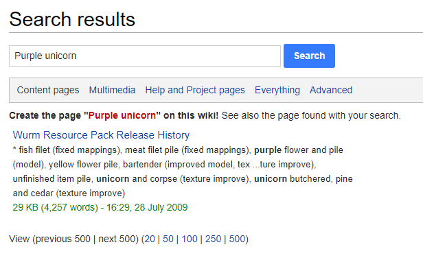
Search for the page. If it exists, it will take you there; if not, you will see similar pages, with a red link offering you the option to create the page.
Click the red link to be taken to the not yet created article, where you can begin editing.
Article Content
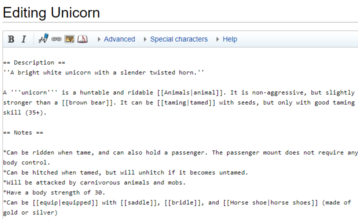
When creating a page, it can be helpful to find a similar page to kind of copy from. You don't always, and will rarely, need to create an article totally from scratch. In our Purple unicorn example, we may find useful information on the Unicorn page. If most information is the same, you could find it easier to go into the Unicorn article's Edit page, copy everything, paste it into your new article, then modify it to match the info you have about the Purple unicorn. (Note: I regret to tell you, but I don't think purple unicorns are in the works for Wurm Online at this time. I'm sorry!!!) Or if a new tool was introduced to Wurm, you could find a similar tool page to copy from - this can give you a head start on some of the categories, materials, right-click menus, equipping information, etc.
If you do choose to do this when making an article, make sure that every reference to the current page (aside from {{PAGENAME}}, which will give the name of whichever page it is currently on) is changed to that of your current article. Also be sure to check the categories, as some may be in categories that are not relevant to the new article.
Headers
One useful thing that you'll find on most Wurmpedia articles is a header of links which shows what categories the item is a part of.
These headers are very helpful as they help the reader discover other things they can do with particular skills, or have a quick glance to see what skill the item uses.
TIP: I like to find a page that is similar to what I am working on and copy the header they have there. In our unicorn example, it would be: [[CDB|Main]] / [[:Category:Bestiary|Bestiary]] / '''{{PAGENAME}}'''
Linking Articles to Categories
Categories are listed at the bottom of every article. They are useful for similar reasons as the headers by providing links to discover items related to the one the reader is viewing. The categories are a specific type of page which links to other articles, gathering articles of a certain type in one place.
There are many categories available for articles to be linked under, which can be seen here: https://wurmpedia.com/index.php/Special:Categories.
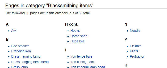
To add your article to a category, simply link to it the same way you would link to another page. For example, if linking to the category "Blacksmithing items", you would add [[Category:Blacksmithing items]] to the bottom of your article.
Fun Fact: You can create a clickable link to get to that category page by adding a colon to the beginning. To link to the Blacksmithing items category, you would add [[:Category:Blacksmithing items]].
Babel categories
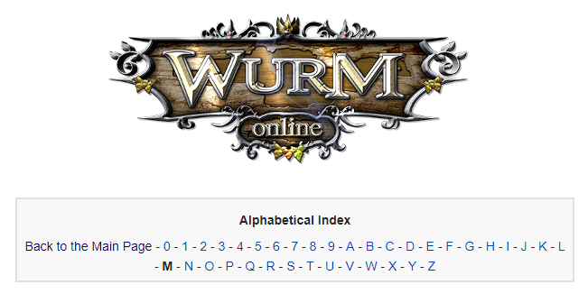
Every article on the main namespace should be linked to a letter in the Babel alphabetical index. This is a series of category pages that show articles beginning with that number or letter. To link to a Babel category, simply add [[Category:Babel/F]], where F is the letter or number you wish to add it to.
Side note: A namespace is a section on the Wurmpedia designed to hold specific types of articles. So far, you have worked with the Main, Category, and Template namespaces. Main namespace articles are articles that do not begin with a word and a colon; for example, the article titled "Category:Blacksmithing items" is in the Category namespace.
Note: Categories can be linked anywhere in an article, but are linked at the bottom in order to be consistent and easy to locate.
Templates
A template is a code written in the Template namespace which can be used to copy information to similar pages.
Things you can do with a template:
- Add Wiki Markup to style text, create tables, add images
- Copy information to multiple pages that use the same information
- Create "if" statements that can put certain text on a page if certain conditions are met
Why use a template?
- Saves time with creating or editing multiple pages
- If game mechanics change, you need only edit the template rather than all articles
- Ensures uniformity in layout of similar pages
- Allows for quick layout changes should they be needed or wanted
Templates are a great tool that should be used in most cases that 2 or more pages share information. Common templates are ItemBox and Creature. You can see the templates here: https://wurmpedia.com/index.php/Category:Template. They look scary at first, but if you take the time to break down each part, you can see each part's usage/meaning. Templates are laid out in a way that is as user-friendly as possible, and have a description of how to use them on articles.
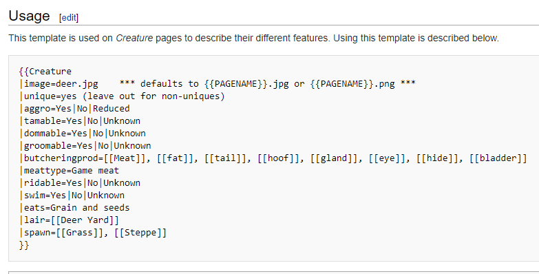
In the case of our purple unicorn, we will need a creature template, which is found here: https://wurmpedia.com/index.php/Template:Creature.
{{Creature |image=deer.jpg *** defaults to {{PAGENAME}}.jpg or {{PAGENAME}}.png *** |unique=yes (leave out for non-uniques) |aggro=Yes|No|Reduced |tamable=Yes|No|Unknown |dommable=Yes|No|Unknown |groomable=Yes|No|Unknown |butcheringprod=[[Meat]], [[fat]], [[tail]], [[hoof]], [[gland]], [[eye]], [[hide]], [[bladder]] |meattype=Game meat |ridable=Yes|No|Unknown |swim=Yes|No|Unknown |eats=Grain and seeds |lair=[[Deer Yard]] |spawn=[[Grass]], [[Steppe]] }}
Copy and paste from {{ to }}, then replace with your purple unicorn's information:
{{Creature |image=PurpleUnicorn.jpg |aggro=No |tamable=Yes |dommable=Yes |groomable=Yes |butcheringprod=[[Meat]], [[fat]], [[tail]], [[hoof]], [[gland]], [[eye]], [[hide]], [[bladder]] |meattype=Horse meat |ridable=Yes |swim=Yes |eats=Grain and seeds |lair=[[Rainbows]] |spawn=[[Grass]], [[Steppe]] }}
The main thing to note is that a | line indicates a new line of information, or different options (eg: Yes|No|Unknown)
Creating a Template
Step 1: Choose a name for your template and go to create the page.
Step 2: Content
We want the template to tell pages "This is a <colour> unicorn". For the basic text, you can just add it within the tags. To make a part show user input, it needs to be within three curly brackets {{{ and }}}. In this case, we want the user to specify the colour, so we can put {{{color}}}. Now, our text will look like this:
This is a {{{color}}} unicorn.
Now, check that it works! After saving this, you can go to another article and add the template with curly brackets. In this case:
{{Unicorn}}
Using show preview, you will see your template content!
Great! But on this page, we want it to say "This is a purple unicorn." Since we have "color" in curly brackets, we can specify this option. To do this, you will add a new line to your template link, like so:
{{Unicorn |color=purple}}
Now on clicking show preview, you will see:
Step 3: Include and noinclude
Any content written directly into the template will show on both the template’s page as well as any pages using the template.
Any content you want to show only on pages using this template and not the template itself should be within <includeonly> and </includeonly>. This will make your code invisible on the Template page, and only visible when the template is used.
<includeonly>
This is a {{{color}}} unicorn.
</includeonly>
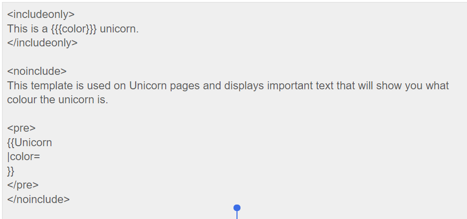
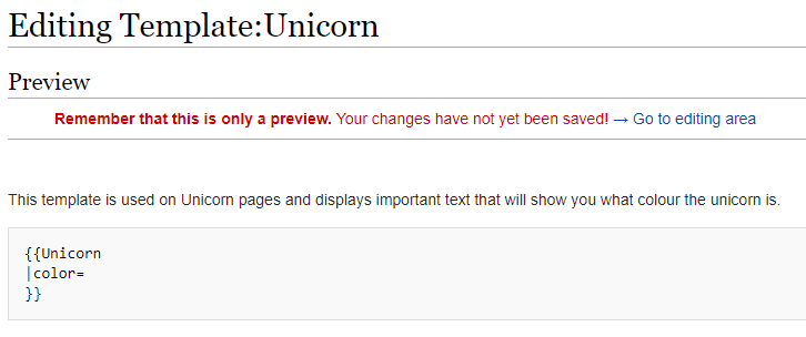
To put information only on the Template:Unicorn page, it will need to be within <noinclude> and </noinclude> tags. This will prevent anything written in these tags from being shown on pages the template is used on. This is used to display information about your template.
<includeonly>
This is a {{{color}}} unicorn.
</includeonly>

<noinclude>
This template is used on Unicorn pages and displays important text that will show you what colour the unicorn is.
</noinclude>
Result:
It is also important to put instructions on how to use the template in the noinclude tag as well. Templates put this information within <pre> and </pre> tags, which shows the contained information in a light grey-coloured box. It also allows you to display code, which is great for giving a sample of the template for users to copy and paste so they may use it.
“If” Statements
What is an if statement ?!
For those who are not familiar with coding, an if statement is something that is used to do a certain thing if the statement is true, and something else if it is false. For example:
If 1+1=2: Say yes
If 1+1=3: Say no
If this was your code, it would result in Say yes.
How do I make an if statement?
In templates, we sometimes want to add an if statement so that we can make the template work in many different articles. For example, in the Fence template, here is a sample of an if statement:
{{#if:{{{gate|}}}|[[Iron fence gate]]|[[Iron fence]]}}
Let's break this down and see what is going on here! First, your if statement needs to be inside 2 curly brackets: {{ and }}. If statements are started by typing #if: If statements will have a true and a false side to them, respectively. To separate what will happen in each case, you use vertical bars |.
{{#if:<what you're checking>|<what happens if it's true>|<what happens if it's false>}}
The thing you want to check with your if statement will go after the colon. In this case, we are checking the argument called "gate". Arguments are used in 3 curly brackets {{{ and }}}. If you want to look for something specific, you will need to use a different kind of if statement, #ifeq: which we will discuss shortly. In this case, the statement is checking for whether the argument "gate" is defined with anything at all, so there is nothing to the right of the bar.
{{#if: {{{gate|}}} |<what happens if it's true>|<what happens if it's false>}}
For the true/false sections, you can place text that will be displayed if the if statement reaches that section. In this example, if it is true the page will display Iron fence gate, which is a link to the Iron fence gate article.
Tip: You can place if statements within if statements for more complex scenarios. For example, maybe you want an if statement that does something like this:
[picture of tree I guess]
But let's not get ahead of ourselves. Getting started with if statements is enough on your plate!
If a variable = something specific:
The next if statement we should talk about is the #ifeq statement. This is used when you want to ask if something matches something else. In our case, we will just about always use it to ask if an inputted variable is something specific. For example, you may have "material" as a variable in your template, where a user would put what material it is made of. Let's say you want the page to display that a pottery bowl is used in cooking if the material given is "clay", and otherwise display "Cannot be used in cooking."
{{#ifeq:{{{material}}}|clay|A pottery bowl is used in cooking.|Cannot be used in cooking.}}
This statement will give either one or the other, depending on what material is given. Notice that the variable named "material" is enclosed in three curly brackets, and then has three sections divided by vertical bars after it, whereas the #if statement we looked at a moment ago only had two sections. This format adds a section after the variable where you can tell the statement what you are checking the variable for. After that, the last two sections are the same: what to display if it is true, then what to display if it is false.
Switches - The Multi-Scenario “if” Statement
A switch is a type of if statement in which you can define multiple things that may be contained within an argument, and what will happen in each case.
You may wish to use a switch when you want to display a different line of text depending on what is entered.
For example, your argument may be "server", with options being Xanadu, Pristine, Exodus, Celebration, Deliverance, Chaos, Release, and you may wish to provide a different map link depending on which server is inputted. Here is what it would look like:
{{#switch: {{{server}}} |Xanadu = link to Xanadu map |Pristine = link to Pristine map ... }}
Like with if statements, you need to have #switch: contained within curly brackets. Right after that, indicate your argument name within 3 curly brackets. Next, you will have a vertical bar followed by the text you want to match in that argument. Follow that with an equal sign, and then the text you want to display on the page if that instance is true.
NOTE: Your display text cannot contain any vertical bars in a switch because the switch searches for the bar to look for the next case you are asking for. Vertical bars will most commonly be found in a table, which begins with {|. You can either put the information in another template and call that template to be inserted, or use HTML code instead.
Tables
The MediaWiki Wiki says that it is best to avoid table making unless needed due to the complication of table code... but I say tables make some wiki pages so much prettier to look at, and can make information easier to present. Maybe just try to get it right the first time so you don't have to edit it later! Or, if you're brave enough, maybe you can come up with a template to make tables easier!
Table Construction Markup
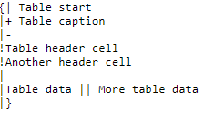
Let's start with the markup. The following is taken from mediawiki.org.
{|  table start, required

|+  table caption, optional; only between table start and table row

|-  table row, optional on first row—wiki engine assumes the first row

!   table header cell, optional. Consecutive table header cells may be added on same line separated by double marks (!!) or start on new lines, each with its own single mark (!).

|   table data cell, optional. Consecutive table data cells may be added on same line separated by double marks (||) or start on new lines, each with its own single mark (|).

|}  table end, required
Unfortunately, each of these codes do have to go on a new line, which can make your article look really complicated, especially if you create bigger tables. Using these codes gets you the layout of a table without any borders, backgrounds, or anything - just text.
This *could* be useful in some cases, but generally when making a table, you'll probably want it to look like a table and not just a bunch of floating words. For example, on the Animals article, there is a giant table that looks like this:
To make your table look like a table, you need to tell it that you'd like there to be a border, for example. We'll take a look at some different formatting options available for tables now.
Table Alignment
You can align the entire table as well as text within the table.
For table alignment, you have the option of right alignment, centered alignment, or left alignment (which is just default). You can also float the table in the article, meaning that the article's text will wrap around your table.
So let's look at how to achieve these alignment styles!
To align the table to the right, you'll add
style="margin-left:auto;"
to your table start line, which is
{|
| Column 1 | Column 2 | Column 3 |
|---|---|---|
| Row 1 | Row 1 | Row 1 |
| Row 2 | Row 2 | Row 2 |
Below is the code to create this table:
{|style="border-style: solid; margin-left:auto;" border="1"
!Column 1
!Column 2
!Column 3
|-
|Row 1||Row 1||Row 1
|-
|Row 2||Row 2||Row 2
|}
To align the table to the center, you'll add
style="margin:auto;"
to your table start line.
| Column 1 | Column 2 | Column 3 |
|---|---|---|
| Row 1 | Row 1 | Row 1 |
| Row 2 | Row 2 | Row 2 |
Finally, you can float the table alongside the article text by adding the following to your table start line:
style="float:left;"
or
style="float:right;"
Text Alignment
Text alignment in cells can be left, right, or center-aligned, as well as vertically aligned to the top, middle, or bottom.
Horizontal Alignment
To align to the left, right or center, use
style="text-align:center;"
This code can be used in the table start, row start, or cell start levels.
If placed at the table start level, it will align all text within the table the way specified.
| Row 1 | Row 1 | Row 1 |
| Row 2 | Row 2 | Row 2 |
| Row 3 | Row 3 | Row 3 |
| Row 4 | Row 4 | Row 4 |
{| border="1"; style="height:100px; width:100px;text-align:center;"
|-
|Row 1||Row 1||Row 1
|-
|Row 2||Row 2||Row 2
|-
|Row 3||Row 3||Row 3
|-
|Row 4||Row 4||Row 4
|}
If placed at the row start level, it will only align the text within that row's cells the way specified.
| Row 1 | Row 1 | Row 1 |
| Row 2 | Row 2 | Row 2 |
| Row 3 | Row 3 | Row 3 |
| Row 4 | Row 4 | Row 4 |
{| border="1"; cellpadding="10;"
|- style="text-align:center;"
|Row 1||Row 1||Row 1
|-
|Row 2||Row 2||Row 2
|-
|Row 3||Row 3||Row 3
|-
|Row 4||Row 4||Row 4
|}
If placed at the cell level, it will only align that individual cell the way specified.
|-style="text-align:center;"
Note: When adding styling code such as this to the cell level, you need to add a vertical bar after your code, dividing it from the text your cell contains. For example, the second row in this code looks like this:
|Row 2||style="text-align:center;"|Row 2||Row 2
Vertical Alignment
Vertical alignment can be set to top, middle, or bottom with, at cell or row level.
style="vertical-align:bottom;"
| A | B | C |
| D | E | F |
| G | H | I |
The first row is vertically aligned to the top, the second to the middle, and the third to the bottom. In this example, the code is applied to the whole row.
{| class="wikitable"
|- style="vertical-align:top;"
| style="height:100px; width:100px; text-align:left;" | A
| style="height:100px; width:100px; text-align:center;" | B
| style="height:100px; width:100px; text-align:right;" | C
|- style="vertical-align:middle;"
| style="height:100px; width:100px; text-align:left;" | D
| style="height:100px; width:100px; text-align:center;" | E
| style="height:100px; width:100px; text-align:right;" | F
|- style="vertical-align:bottom;"
| style="height:100px; width:100px; text-align:left;" | G
| style="height:100px; width:100px; text-align:center;" | H
| style="height:100px; width:100px; text-align:right;" | I
|}
You can use the code at the cell level as well, which will modify the individual cell.
| Row 1 | Row 1 | Row 1 |
| Row 2 | Row 2 | Row 2 |
{| border="1" style="width:300px; height:200px;"
|-
|style="vertical-align:top;"|Row 1||style="vertical-align:bottom;"|Row 1||style="vertical-align:top;"|Row 1
|-
|Row 2||Row 2||Row 2
|}
Note: When adding styling code such as this to the cell level, you need to add a vertical bar after your code, dividing it from the text your cell contains.
style="vertical-align:top;"|Row 1||
Cell, Row, and Table Sizing
You can set the size of the table, rows, and cells to a width and height in pixels or percentages of the screen. Percentages are recommended as they will ensure a similar view for any screen size.
To set the width or height, these are the codes you will use - they are used at the table start or individual cell levels:
style="width:50%;"
style="height:50px;"
Width: Used on the table start level, this will adjust the total size the table will take up, in height or as a percentage of the screen/browser window. Used on the individual cell level, it will adjust the amount of space it takes within the table.
Height: Used with a percentage will indicate what percentage of the table it will take up. On the table start level, a percentage cannot be used with the height - use 'px' for pixels instead.
Example 1: Defining a table's width and height
| Row 1 | Row 1 | Row 1 |
| Row 2 | Row 2 | Row 2 |
{| border="1" style="width:75%; height:300px;"
|-
|Row 1||Row 1||Row 1
|-
|Row 2||Row 2||Row 2
|}
Example 2: Defining a row's height
| Row 1 | Row 1 | Row 1 |
| Row 2 | Row 2 | Row 2 |
{| border="1" style="width:75%; height:300px;"
|-style="height:75%;"
|Row 1||Row 1||Row 1
|-
|Row 2||Row 2||Row 2
|}
Row and Column Spans
You can span cells across multiple rows or columns, which is the same as merging cells together in word processing programs. To span a cell across multiple columns:
colspan="2"
To span a cell across multiple rows:
rowspan="2"
Each of these is used at the individual cell level. Note that your table will have as many columns as the largest row; this means that if your table has 3 columns per row, and you use a column span on one of your cells, your table will be 4 columns wide.
| Row 1 | Row 1 | Row 1 | |
| Row 2 | Row 2 | Row 2 | |
{| border="1"
|-
|colspan="2"|Row 1||Row 1||Row 1
|-
|Row 2||Row 2||Row 2
|}
| Row 1 | Row 1 | Row 1 | Row 1 |
| Row 2 | Row 2 | ||
{| border="1"
|-
|rowspan="2"|Row 1||Row 1||Row 1||Row 1
|-
|Row 2||colspan="2" |Row 2
|-
|}
Colouring - Tables, Cells, and Text
Sometimes it may be nice to add some colour to the table, at least to make it stand out on the article a bit more. Since we're in the table business, let's look at the colour codes in a table! Note that colours can be written or specified with the hex value.
| Colour text | style="color:white;"
style="color:#009999;" |
| Colour entire table or cells | style="background-color:white;"
style="background-color:#009999;" |
| Column! | Another column | Another one |
| A new row | this row is coloured differently! | final cell |
{|style="color:white; background-color: #009999; width: 50%;"
|style="background-color: black;"|Column! || Another column || Another one
|- style="background-color:white; color:black;"
|A new row ||this row is coloured differently! || final cell
|}
Colour codes can be placed at different levels depending on what you are trying to achieve. In the table I have created above, the whole table is coloured a teal colour, while some other cells are coloured differently. This gives the illusion of a coloured border when a border size is not specified.
Table Borders and Spacing
Table Borders
By default, tables are made with no borders, as you saw in Tables: Basic Construction.
| Row 1 | Row 1 | Row 1 |
| Row 2 | Row 2 | Row 2 |
This doesn't make it look much like a table now, does it?
To add a simple border, you can add the following code at the table start level:
border="1"
| Row 1 | Row 1 | Row 1 |
| Row 2 | Row 2 | Row 2 |
You can change the border width on each side of the table by using the following at the table start level:
style="border-width:10px 40px 80px 0px;"
These define top, right, bottom, and left borders respectively.
| Row 1 | Row 1 | Row 1 |
| Row 2 | Row 2 | Row 2 |
If you wish to have the top and bottom have the same border width, as well as the left and right sides to have the same, it is defined by top/bottom and left/right respectively.
style="border-width:10px 40px;"
| Row 1 | Row 1 | Row 1 |
| Row 2 | Row 2 | Row 2 |
Table Spacing
You can add some space in your cells by adding cell padding. To do so, add the following code to the table start level:
cellpadding="10"
This will create a 10-pixel margin of space in every direction in your cell.
| Row 1 | Row 1 | Row 1 |
| Row 2 | Row 2 | Row 2 |
Table Classes (Styles)
There are some table classes that provide some table formatting for you.
To add a class to your table, simply add the class name to the table start level. For example:
{|class="wikitable"
Wikitable
The wikitable class gives a light grey background to cells, and simple table borders.
| Column 1 | Column 2 | Column 3 |
|---|---|---|
| Row 1 | Row | Row |
| Row 2 | Row | Row |
{|class="wikitable"
!Column 1
!Column 2
!Column 3
|-
|Row 1||Row||Row
|-
|Row 2||Row||Row
|}
Wikitable Sortable
The wikitable sortable class gives the same things as the wikitable class does, but also makes your columns sortable (alphabetically).
| Column 1 | Column 2 | Column 3 |
|---|---|---|
| Row 1 | Row | Row |
| Row 2 | Row | Row |
{|class="wikitable sortable"
!Column 1
!Column 2
!Column 3
|-
|Row 1||Row||Row
|-
|Row 2||Row||Row
|}
Sortable
The sortable class adds the ability to sort columns alphabetically without the wikitable formatting.
| Column 1 | Column 2 | Column 3 |
|---|---|---|
| Row 1 | Row | Row |
| Row 2 | Row | Row |
{|class="sortable"
!Column 1
!Column 2
!Column 3
|-
|Row 1||Row||Row
|-
|Row 2||Row||Row
|}

